Hello again!
I've been looking for songs to dance to for a dance that myself and a few other girls are involved in. We've been talking about improving our synchronization, hand gestures, etc. Just really small things that make a big difference from an audience perspective.
My choreographer showed us this dance, and I think it's the perfect example of what our garba should look like. There's so many people in the dance, yet they're all in sync with each other. They make really big hand gestures that are controlled, so that it looks really good from an audience view.
It looks like it took a really long time to get it perfect, but it was probably really worth it for them.
I was really inspired by this video just because I could tell there was a lot of hard work put into this dance, and one day I hope I can be as good as them.
Saturday, June 19, 2010
Art in Food?
 Hey!
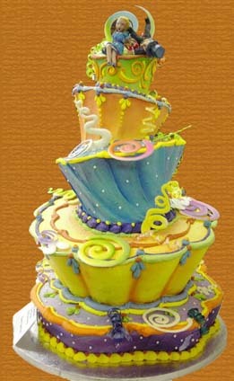
Hey!Maybe I'm just craving sweets while I'm writing this, maybe I'm just too tired, or maybe I actually believe cooking is an art. I think it's a mix of all three. I was watching the show Ace of Cakes on the Food Network and I realized that food can be really pretty. And most importantly, edible.
For example, the cake shown on the left just looks amazing! It's insane how anyone could craft such a thing out of food. I'm not so sure how it would taste though, but I wouldn't want to take the first bite and ruin it. I love the detail and the fun colours of it. You can tell that the people that made it are really creative and talented.
It's when I look at things like this that I want to learn how to cook. Ever since a kid I've wanted to, but I'm lazy (I've probably mentioned this before) and I just never got around to it. But then again, my mom said I have to learn this summer if I don't get a job or get an extra credit. So I guess when I'm forced to learn these things I'll enjoy doing it. Of course, I'm not going to learn how to bake things like cookies and cake, but I really want to know how to cook my own traditional Indian food. That's what I'm going to want to eat if I move away for University.
There's even art in Indian food, though, and that's what I love. Everything can be made to look unique and attractive.
Well that's all for now, if you don't already watch the show Ace of Cakes, check it out, but try not to get hungry:)
Change of Heart - A Novel by Jodi Picoult
 Hey!
Hey!So because the movie My Sister's Keeper came out, I really wanted to read the book before seeing the movie... unfortunately due to my laziness I never got around to doing either.
But, the other day I was at the bookstore, and a book by Jodie Picoult (The author of My Sister's Keeper) was on sale. I figured "why not" to see if I would like the way she writes.
The book I read was Change of Heart, and it turns out that I love the way she writes. I was really shocked at the story line. Judging from the book title and cover, I figured it would just be another love story. I was really wrong. It has so many topics packed into one book, and somehow it all fits together.
Religion has been included in the book; peoples' beliefs have been challenged just by meeting new people.
What shocked me most was that the main topic in the book was the death penalty, and that the book took place in 2008.
In a nutshell, one of the characters in the book's husband and daughter were murdered. The murderer was sent to prison and was going to be give the death penalty in 11 years. The mother had her late husband's daughter shortly after her daughter and the guy that murdered the two people was sentenced to death. 11 years later, the daughter, Claire, needs a heart, and Shay (the murderer) wants to give his to her when he dies. All the prison guards think he's going crazy because of that and call in a Priest to be his "spiritual advisor." After some miracles Shay performed, people are starting to believe he's God. After a while even the Priest is convinced.
A lot of other things happen, but I just wanted to show you how many different topics there are in the book, and I really recommend it to anyone who is looking for something to read.
And now I have to get more of her books for summer!
A Picture with a Story:)
 Hello!
I was just looking through some of my pictures and stumbled upon this one!
I thought it was really cool; I actually remember taking it, about a year ago.
I like how it's black and white. I'm not really sure what the picture is of; I kind of just randomly took a picture of a flower type object.
I was up at my friend's house that week (it's a farm.) The weather was really cool; it was the time where it was changing from winter to spring, so it was warm enough to go outside without a jacket, but there was still ice outside where the small ponds were. So naturally we tried stepping on the ice (carefully, of course.)
I just think it's a cool feeling to be able to only wear a sweater, but to have it still look like winter. Even if there is slush everywhere, I really like the feeling of it.
Anyways, I'll be back later:)
Wednesday, June 16, 2010
Knowledge Will Set You Free
 Hey!
Hey!I just wanted to share a project I did in my tech class. We made t-shirts based on The Universal Declaration of Human Rights.
I did mine based off of article 26(2):
"Education shall be directed to the full development of the human personality and to the strengthening of respect for human rights and fundamental freedoms. It shall promote understanding, tolerance and friendship among all nations, racial or religious groups, and shall further the activities of the United Nations for the maintenance of peace."
I really liked the article, because it reminded me of the quote "knowledge will set you free," which I believe it does. I think education can give people freedom, because it gives them a sense of wrong and right. Education teaches people to act civil to each other, and to respect all ethnicity and genders. And if education isn't used to do that, then it's wrong.
If all people around the world had a basic education and were taught to respect everyone, I think the world could be like the picture. Maybe not to such an extent that there is confetti spraying from a person's head, but there could be less war and dislike among nations.
I'll blog again soon!
The iPhone 4
Hello!
A while ago, I heard that apple was coming out with a new iPhone; I thought this was insane, especially with the release of the iPad. But I'm starting to learn that anything is possible with Apple.
When they revealed the information on the apple website was when I actually started to believe that they came out with another phone. I watched the video, although there isn't that much that is different. Now there is something called "face time" because of the two cameras on either side of the phone. I thought "it's not that much of a big deal, many phones have that feature." But then I saw how you can use both cameras to chat, and I thought that was impressive.
The main changes were the internal camera, and that the camera quality has improved it is now five megapixels rather than three. Not only that, but the iPhone finally has a flash. I also found it really cool that the phone now has iMovie to edit the videos you take on the phone.
The resolution has apparently improved a whole lot, with new really strong glass on both sides of the phone.
Overall, I think the phone looks really good, and I'd say I'm thinking about getting one, but I've yet to find a summer job. And besides, I'm perfectly content with everything I have now, but if anyone is considering getting one, I'd say they should.
Rebel Without a Cause... On Stage
Hey guys!
So last night I went to see my old school's main stage. They performed Rebel Without a Cause. When my sister (who is the stage manager) told me that was the play they were doing, I was shocked. It has alcohol, gangs and violence. I wasn't sure how well a bunch of middle school kids would be able to handle all of that maturely.
The play had professional lighting and sound. They even had headsets, to communicate when the cues would be (when to turn the lights on and off, and when to play the music.)
When I went to see it, I wasn't shocked to see that most of the fight scenes were interpreted by dance; that's what we did when I was in the same school's production of Animal Farm. Even though I was expecting it, I still thought it was really interesting that the director would think of something like that to do.
There was one actual fight scene, including knives, (I guess some things are better not interpreted in dance) which was done very professionally, and their stage falls were really good.
The thing I was most impressed about was that there was a technical issue. The lighting board wasn't working at one point; the lights were supposed to go off and the two actors were supposed to exit the stage. When the lights did not go off, they were completely professional and frozen. They didn't even twitch. When they got the signal, they left very professionally. I know many people were talking about how mature they acted, and that's what really impressed me that night.
If I have the chance, I'm definitely going again:)
Sunday, June 6, 2010
Another Tutorial- Vines and Branches
Happy Sunday! Well I guess that depends on how much work you have to do...
I was looking for something to blog about and found another illustrator tutorial. I thought it was really cool.
I really liked the tutorial because of the curves and twirls in it. In the tutorial I also learned how to make custom brushes and symbols, which is surprisingly simple; all you have to do is make the shape or brush stroke you want, then drag it into the brushes or symbols palette, then adjust the settings for it.
So first you should start off with a curvy line, drawn with the pen tool or the brush or pencil tool (whatever you prefer).
Here is where you make one of the custom brushes. Use the pen tool or the triangle tool to make a shape like this:
For the settings to put for the new brush, go to the tutorial (Step 3).
So now that you have the brush, click on the curve you made and apply the brush.
Next you can apply another branch/vine; make the stroke size smaller (like the varying sizes in my picture below).
Now use the pen tool to make some leaf shapes (like the ones in the picture below), and keep them relatively small. Now drag them into the symbols palette, name the leaves something that makes sense, and make sure you click "graphic" rather than "Movie clip."
 For some of the other vines, you have to make another brush; make it look something like this:
Follow the same directions for the first custom brush. On one of the branches, use the pen tool to make a small arc, then apply the brush to it.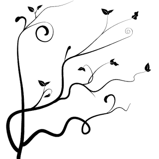
Next is the part where you can be creative, just keep making swirls and branches until you're satisfied with what you've got.
I really like my final product, and I'm probably going to use if for things like backgrounds and websites.
In the rest of the tutorial, it switches the image into Photoshop and makes a cool background, check it out if you wanna see:)
I hope that was helpful:)
I was looking for something to blog about and found another illustrator tutorial. I thought it was really cool.
I really liked the tutorial because of the curves and twirls in it. In the tutorial I also learned how to make custom brushes and symbols, which is surprisingly simple; all you have to do is make the shape or brush stroke you want, then drag it into the brushes or symbols palette, then adjust the settings for it.
So first you should start off with a curvy line, drawn with the pen tool or the brush or pencil tool (whatever you prefer).
Here is where you make one of the custom brushes. Use the pen tool or the triangle tool to make a shape like this:

For the settings to put for the new brush, go to the tutorial (Step 3).
So now that you have the brush, click on the curve you made and apply the brush.
Next you can apply another branch/vine; make the stroke size smaller (like the varying sizes in my picture below).
Now use the pen tool to make some leaf shapes (like the ones in the picture below), and keep them relatively small. Now drag them into the symbols palette, name the leaves something that makes sense, and make sure you click "graphic" rather than "Movie clip."
 For some of the other vines, you have to make another brush; make it look something like this:
Follow the same directions for the first custom brush. On one of the branches, use the pen tool to make a small arc, then apply the brush to it.

Next is the part where you can be creative, just keep making swirls and branches until you're satisfied with what you've got.
I really like my final product, and I'm probably going to use if for things like backgrounds and websites.
In the rest of the tutorial, it switches the image into Photoshop and makes a cool background, check it out if you wanna see:)
I hope that was helpful:)
Tuesday, June 1, 2010
Swirls in Illuatrator
Hey!
I was looking at tutorials for Adobe Illustrator and stumbled on THIS ONE. I thought it was cool because it looked simple and easy, but still really cool at the same time.
I actually tried to make one myself, but I messed up halfway through, and being the middle of the night, I don't really want to try again... but I took one screen shot of the beginning:

So basically, you start with a shape, i.e. a circle or a square. Then you select it and go to Effect>Distort & Transform>Transform, and either look at the adjustments in my picture or the tutorial's preview
One you've got your shape, you drag it into the GRAPHIC STYLES window. The cool part after this is you can make a different simple shape like a square and click on the style, and then it will look like the picture on the left, in square version.
The next step is to expand the object you just styled: Object>Expand Appearance, then un group (ctrl+shift+g) the resulting shapes.
 After, double click the blend tool and type in a number in the "specified steps" field.
Now, Ctrl-Opt-B with everything selected to make the blend, and it should turn out something like as seen on the left.
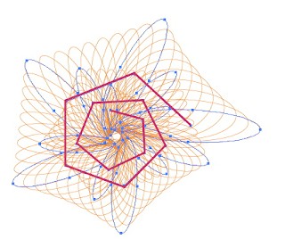 And you should be able to see the path I highlighted in pink; it can be changed to a straight or curvy line. Draw the line and then go to Object>Blend>Replace Spine, and if you go to the tutorial, you'll see the final image.
Thanks for reading! I'll be back soon:)
Sunday, May 16, 2010
The Girl Effect and Typography
Hey guys! I hope you had a good weekend.
So you may have read something about "the girl effect" in my previous blog, well today I'm dedicating this post to the introduction video.
A little while ago in tech class we had a whole unit about typography, and I saw this video and was amazed by how simple it is, yet it still gives me chills when I watch it. The video is made entirely of writing in a simple and readable font in all capitol letters. The whole video is made of the colours black, white and orange, which I thought was very simple and effective, especially because there are no words actually being said, but only music in the background, but the timing of the words is in sync with the music, especially at 0:31, where is says (DRAMATIC PAUSE) and the music stops briefly at the same time. There's actually a voice in my head kind of pausing and going faster or slower with the words
I also like the meaning behind it, I thought the girl helping a girl concept was really interesting. It really doesn't take a lot of effort to keep someone on the right track, all people need is education and a decent living space, so it's really unfortunate that developed nations have too much, while some developing nations barely have anything, even clean water to drink. I think everyone should check the website out.
Well that's it for now, I'll be back soon!
-Roshni
Thursday, May 6, 2010
Good Websites and Bad Websites
Hey!
I'm going to be discussing what defines a good website and a bad website today.
So what's considered a bad website?

Although I'm a fan of this website, once I learned the 10 principles of Web Design, I deemed it a bad website in terms of design.
True, the site is funny, but when a user goes to the website for the first time, they would lose interest quickly, because you can't tell what the website is about. Once the user looks at the navigation bar, they will see "submit a story" or "vote on submissions" and guess that the website is about sharing stories, but they will not know exactly what the website does until they search around, or go to the "about" section. There is a very eye catching advertisement right at the top of the page, making it one of the most prominent things on the web page. This is bad because it diverts the user's attention away from the actual content of the website. The final reason why I think this is a bad website, in design terms, is that there is too much white space at the sides (it is cut off in the picture) and everything is clustered in the center.
What's considered a good website?
The girl effect is, as quoted on the hom e page, "A powerful social and economic change brought about when girls have the opportunity to participate." There is an introduction page when you enter the website. If you click AGREE or DISAGREE, it takes you to an introduction video (Which I find very inspiring and I will blog about it later) which you have the choice to skip. After that it takes the user to the homepage. The homepage is very clean-cut and straight-forward. There is very effective writing because you can tell that the site is about an organization for girls in developed countries helping girls in developing, poverty-stricken countries. The site is easy to navigate; on the homepage there are three main options: LEARN, GIVE and SHARE, when y
 ou scroll over them, it will tell the user where the link takes them (shown below). The thing I like most about the website is that it's very simple. There is a lot of white space, so it's breathable, and all the animations (which only happen when they are clicked on) are purposeful and effective.
So I hope this post helped you guys see what defines a good and bad website! I shall be back soon!
-Roshni
I'm going to be discussing what defines a good website and a bad website today.
So what's considered a bad website?

Although I'm a fan of this website, once I learned the 10 principles of Web Design, I deemed it a bad website in terms of design.
True, the site is funny, but when a user goes to the website for the first time, they would lose interest quickly, because you can't tell what the website is about. Once the user looks at the navigation bar, they will see "submit a story" or "vote on submissions" and guess that the website is about sharing stories, but they will not know exactly what the website does until they search around, or go to the "about" section. There is a very eye catching advertisement right at the top of the page, making it one of the most prominent things on the web page. This is bad because it diverts the user's attention away from the actual content of the website. The final reason why I think this is a bad website, in design terms, is that there is too much white space at the sides (it is cut off in the picture) and everything is clustered in the center.
What's considered a good website?
The girl effect is, as quoted on the hom
 e page, "A powerful social and economic change brought about when girls have the opportunity to participate." There is an introduction page when you enter the website. If you click AGREE or DISAGREE, it takes you to an introduction video (Which I find very inspiring and I will blog about it later) which you have the choice to skip. After that it takes the user to the homepage. The homepage is very clean-cut and straight-forward. There is very effective writing because you can tell that the site is about an organization for girls in developed countries helping girls in developing, poverty-stricken countries. The site is easy to navigate; on the homepage there are three main options: LEARN, GIVE and SHARE, when y
 ou scroll over them, it will tell the user where the link takes them (shown below). The thing I like most about the website is that it's very simple. There is a lot of white space, so it's breathable, and all the animations (which only happen when they are clicked on) are purposeful and effective.
So I hope this post helped you guys see what defines a good and bad website! I shall be back soon!
-Roshni
Friday, April 30, 2010
Green, Blue and Gray
I was recently hanging out with my friend at her house, and we thought that the weather was too good to stay inside. I brought my camera that day, so we were goofing around and taking a lot of pictures. Most were of the two of us, but some were of plants and landscapes.
The pictures actually turned out really nice, especially the one shown below.
 Even though the sky wasn't perfectly blue, I still like the picture because of the contrast in the bright green leaves compared to the duller blue-gray sky. I like the angle of the leaves and the composition of the pictures, how the leaves are in the corner of the picture. It's cool how you can still see some of the buds of the leaves still blooming, so you can see it's still spring
I also like that it was a spur of the moment picture, instead of actually concentrating and taking many snapshots, it was just one picture that I really liked, and for me, those are when I take the best pictures.
This is another picture I liked; my friend's little cousin gave me some flowers that she picked, and I thought the variety in flowers and the colours were nice, so I took a picture.
 I especially like the smaller purple flowers, because they were scattered on the grass in their backyard, and I think that purple with the green grass looked really pretty.
Anyways, that's all for now, so I shall be back soon!
-Roshni
Friday, April 23, 2010
Ian Sheldon
Hey guys,
I was looking for something to blog about today and stumbled on the Canadian, self taught artist Ian Sheldon.
Sheldon paints and does photography. I looked through the his collections of paintings, and I really liked the collection Rural Paintings. I love the old, broken down feel of the buildings, somewhat because I like the country and rural areas, and I want to live in the countryside at some point in my life.
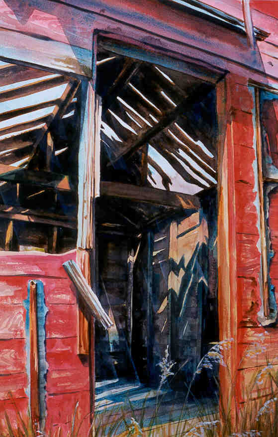
"Fading Red Granary"
Watercolour
I was looking for something to blog about today and stumbled on the Canadian, self taught artist Ian Sheldon.
Sheldon paints and does photography. I looked through the his collections of paintings, and I really liked the collection Rural Paintings. I love the old, broken down feel of the buildings, somewhat because I like the country and rural areas, and I want to live in the countryside at some point in my life.
"Fading Red Granary"
Watercolour
I like the colour choices Sheldon uses. In the picture shown above, the red outshines the browns and grays in the paintings, and I like that my eye goes to the red before it wanders to see inside the building. But then I saw other ones where the neutral colours are dominant, but there's an unexpected splash of colour, like the one below, with the light coming through the window.

"A Door Unhinged"
Watercolour
"A Door Unhinged"
Watercolour
Another collection that caught my eye was Skyscapes. It looks like Sheldon paints the sky at different places and times. I like the variety of colours used in the collection, and how all of them set different moods. I like the picture below because it has a calming mood, and you can tell that the sun is rising.

"October Morning Mists"
Oil on Canvas
"October Morning Mists"
Oil on Canvas
Well that's it for now, I will be back soon, and make sure to look at Ian Sheldon's website!
Wednesday, April 21, 2010
"U"
Hello, hello everyone!
I just wanted to let everyone reading know that my CyberArts class went to see the Sprockets International Film Festival. Unfortunately I had to miss the first show we went to, which were many short films. On the bright side, I met up with my class and saw a wonderful French film called U.
The "U", I believe is short from unicorn, and it is the name of the main character in the film, a unicorn named U (In the picture on the left).
The film was really entertaining, and I believe it was made in France. I noticed a lot of differences from that animation compared to our typical North American animation. For one, the whole movie looked panted or drawn to me, which I thought was really interesting because I'm so used to animated movies looking like they were made to look realistic or computer generated. Another thing was the bright colours used, which I really liked.
The film is a children's film, which I found a bit weird, because some of the content in it was a bit mature. In Canada it would probably be PG-13, but the culture in France is obviously different from Canada, so it was cool to see what else is out there.

If you want to read a bit about the story line, here is a link I found to a short synopsis (scroll to the bottom of the page).
-Roshni
I just wanted to let everyone reading know that my CyberArts class went to see the Sprockets International Film Festival. Unfortunately I had to miss the first show we went to, which were many short films. On the bright side, I met up with my class and saw a wonderful French film called U.
The "U", I believe is short from unicorn, and it is the name of the main character in the film, a unicorn named U (In the picture on the left).
The film was really entertaining, and I believe it was made in France. I noticed a lot of differences from that animation compared to our typical North American animation. For one, the whole movie looked panted or drawn to me, which I thought was really interesting because I'm so used to animated movies looking like they were made to look realistic or computer generated. Another thing was the bright colours used, which I really liked.
The film is a children's film, which I found a bit weird, because some of the content in it was a bit mature. In Canada it would probably be PG-13, but the culture in France is obviously different from Canada, so it was cool to see what else is out there.
If you want to read a bit about the story line, here is a link I found to a short synopsis (scroll to the bottom of the page).
-Roshni
Saturday, April 10, 2010
Candy Cane Text
Hey guys!
I was looking through some photoshop tutorials and I found a tutorial on how to make text look like candy canes. I thought it was cool so I thought I'd check it out.

You start by making the candy cane pattern as the background. After that you type out the text you want and adjust it (adjustments are shown in the tutorial.) Then you have to select the text (ctrl+click on the text layer). The tutorial is straightforward, so it'll guide you through the rest.
I hope that was helpful! It takes a lot of steps, but the finished product (The image shown is from the website, I'm working on my own right now) looks really cool. I know the holidays have passed a long time ago, but I liked the effect.
-Roshni
I was looking through some photoshop tutorials and I found a tutorial on how to make text look like candy canes. I thought it was cool so I thought I'd check it out.
You start by making the candy cane pattern as the background. After that you type out the text you want and adjust it (adjustments are shown in the tutorial.) Then you have to select the text (ctrl+click on the text layer). The tutorial is straightforward, so it'll guide you through the rest.
I hope that was helpful! It takes a lot of steps, but the finished product (The image shown is from the website, I'm working on my own right now) looks really cool. I know the holidays have passed a long time ago, but I liked the effect.
-Roshni
Monday, March 15, 2010
Hey There Spring!
Wow So it's finally springtime and the weather is in double digits, just in time for March Break!
I can't wait to go outside; it's been incredibly gloomy before. Because it's so nice and sunny I just wanna run around and be active.
It makes me so happy when I can step outside with only a light jacket on, and not only that, but now I can stay outside longer because it won't get dark till late.
At night, it looks so good when the sun sets. I can actually go out and enjoy the weather, and it reminds me of past summers and springs and how much fun I've had, and the memories I've made. Now I can't wait to have more fun and make more memories.
I can't wait to walk home once school starts again; I just feel like being active in the sun, even though I'm incredibly uncoordinated.
That's it for this week, I'm gonna enjoy the weather!
Saturday, February 27, 2010
Henri Silberman
Henri Silberman is a photographer, who was born in Paris but grew up in Brooklyn. He has been fascinated with photography since he bought his first camera at age 16.
I looked at some of his work and it really gets my attention. Most of his work is in black and white, with a few colour pictures. I've always been a huge fan of black and white photography, because the contrast is so much clearer, and I think you can actually what's going on in the picture better without colours.
Silberman takes his photos at such perfect timing, it feels like I could walk into them because everything would be moving perfectly. Even though the pictures are still, it still feels like they are moving.
"Spring Swan" By Henri Silberman
")
I love how everything in the photos are bold, and there is high contrast. It gives me something to look at, to think about and that's why I like his work.
"Trees and Shadows" by Henri Silberman
")
You should check out his website, the link to which I've attached in the beginning of the post! I'll blog again in a few days.
I looked at some of his work and it really gets my attention. Most of his work is in black and white, with a few colour pictures. I've always been a huge fan of black and white photography, because the contrast is so much clearer, and I think you can actually what's going on in the picture better without colours.
Silberman takes his photos at such perfect timing, it feels like I could walk into them because everything would be moving perfectly. Even though the pictures are still, it still feels like they are moving.
"Spring Swan" By Henri Silberman
I love how everything in the photos are bold, and there is high contrast. It gives me something to look at, to think about and that's why I like his work.
"Trees and Shadows" by Henri Silberman
You should check out his website, the link to which I've attached in the beginning of the post! I'll blog again in a few days.
Sunday, February 21, 2010
Avatar
Hey guys!
So I was finally dragged to the movies yesterday to watch Avatar. I was a little sceptic at first, because really, another movie about aliens? But it has been at the top of the box office for some time now, so it was obviously something people enjoyed.
You can read the summary here.
And what I'm about to write contains spoilers, so only read what comes next if you've already watched it or if you don't really care.
![]()
It really got me thinking when I came out though. One of the main themes was that humans will do anything for money. They drove over the Na'vi's sacred trees just so they can get access to the valuable material there.
Humans destroyed the Na'vi's homes and even killed some of them. People are driven by greed. I love that so many people acknowledge that and raise awareness of it.
Filmmakers sneakily put in the message that humans are destroying the Earth, and in Avatar, they showed that humans were going to destroy Pandora, (the Na'vi's planet) too. It made me think that there are people that care about our planet, and they are smart enough to make people think about it in a movie.
Seeing that, and remembering other movies I have seen that convey similar messages, I want to communicate messages like that through my art.
I think I'm going to try and work like that now. New projects I start, I think are going to have to do with that; I really want to make a difference.
Anyways, that's all for this week, I'll post again in a few days.
Roshni
Monday, February 15, 2010
El Anatsui

I found out recently that I am a very privileged student, because I get my artwork displayed at the ROM, along with the world renowned artist El Anatsui. And because of that I'm going to share some information about him.
Anatsui is a sculpter, born in 1944 in Anyako, Ghana, and was taught at the College of Art, University of Science. He has been working as a professor at a Nigerian University for about thirty years.
Much of Anatsui's work is based on traditional Ghanaian beliefs. The mediums he uses change a lot; once it was clay, mixed normally with manganese. After, he made wall panels with wood strips placed next to each other; he cut and burned designs into them.
Some of the themes of his work are destruction and reconstitution, as mentioned before, he likes to base things off traditional Ghanaian and African beliefs and cultures.
Most recently, he has taken hard, ugly metal liquor bottle caps taken from garbage and turned them into something beautiful and flowing. He wants to get rid of metal's usual stereotype of hard, rigid, stiff, rusty material, and let people see that it can be soft, and it can be beautiful. Some also resemble African cloths.
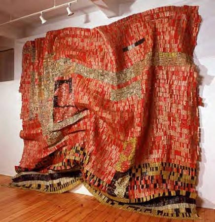
His artwork has focused on a wide range of social, historical and political issues. The art can have many meanings. A historical example is that European traders used liquor bottles as currency when they wanted slaves, and the liquor was usually a product of slave labour. Anatsui's artwork reminds people of this.
Anatsui's work is extraordinary to me, especially his metal cloths. They jump out at me and they look so delicate and soft to touch. He makes me think that metal doesn't always have to be a hard, heavy, ugly brick. It looks almost delicate, like it would tear if anyone were to touch it, and I never would have thought of metal in that way before I saw his work.
I am ecstatic that I am going to be working with such a talented artist at the ROM, and I know it's going to be an experience I'll never forget.
Works Cited:
"Brahim El Anatsui." African Success. 14 Jul 2007. African Success, Web. 15 Feb 2010
Worth, Alexi. "A Thousand Bottles." The New York Times. 02 Feb 2009. The New York Times, Web. 15 Feb 2010.
Wednesday, February 10, 2010
Hello All
Hi everyone! I'm Roshni Patel, and I'm a year 2 CyberArts student. This is my first entry, and I'll be posting alot. As time goes I'll work on the blog frequently, posting graphics, pictures, artwork and such. I hope you like your visit!
Subscribe to:
Posts (Atom)