Hey guys! I hope you had a good weekend.
So you may have read something about "the girl effect" in my previous blog, well today I'm dedicating this post to the introduction video.
A little while ago in tech class we had a whole unit about typography, and I saw this video and was amazed by how simple it is, yet it still gives me chills when I watch it. The video is made entirely of writing in a simple and readable font in all capitol letters. The whole video is made of the colours black, white and orange, which I thought was very simple and effective, especially because there are no words actually being said, but only music in the background, but the timing of the words is in sync with the music, especially at 0:31, where is says (DRAMATIC PAUSE) and the music stops briefly at the same time. There's actually a voice in my head kind of pausing and going faster or slower with the words
I also like the meaning behind it, I thought the girl helping a girl concept was really interesting. It really doesn't take a lot of effort to keep someone on the right track, all people need is education and a decent living space, so it's really unfortunate that developed nations have too much, while some developing nations barely have anything, even clean water to drink. I think everyone should check the website out.
Well that's it for now, I'll be back soon!
-Roshni
Sunday, May 16, 2010
Thursday, May 6, 2010
Good Websites and Bad Websites
Hey!
I'm going to be discussing what defines a good website and a bad website today.
So what's considered a bad website?

Although I'm a fan of this website, once I learned the 10 principles of Web Design, I deemed it a bad website in terms of design.
True, the site is funny, but when a user goes to the website for the first time, they would lose interest quickly, because you can't tell what the website is about. Once the user looks at the navigation bar, they will see "submit a story" or "vote on submissions" and guess that the website is about sharing stories, but they will not know exactly what the website does until they search around, or go to the "about" section. There is a very eye catching advertisement right at the top of the page, making it one of the most prominent things on the web page. This is bad because it diverts the user's attention away from the actual content of the website. The final reason why I think this is a bad website, in design terms, is that there is too much white space at the sides (it is cut off in the picture) and everything is clustered in the center.
What's considered a good website?
The girl effect is, as quoted on the hom e page, "A powerful social and economic change brought about when girls have the opportunity to participate." There is an introduction page when you enter the website. If you click AGREE or DISAGREE, it takes you to an introduction video (Which I find very inspiring and I will blog about it later) which you have the choice to skip. After that it takes the user to the homepage. The homepage is very clean-cut and straight-forward. There is very effective writing because you can tell that the site is about an organization for girls in developed countries helping girls in developing, poverty-stricken countries. The site is easy to navigate; on the homepage there are three main options: LEARN, GIVE and SHARE, when y
 ou scroll over them, it will tell the user where the link takes them (shown below). The thing I like most about the website is that it's very simple. There is a lot of white space, so it's breathable, and all the animations (which only happen when they are clicked on) are purposeful and effective.
So I hope this post helped you guys see what defines a good and bad website! I shall be back soon!
-Roshni
I'm going to be discussing what defines a good website and a bad website today.
So what's considered a bad website?

Although I'm a fan of this website, once I learned the 10 principles of Web Design, I deemed it a bad website in terms of design.
True, the site is funny, but when a user goes to the website for the first time, they would lose interest quickly, because you can't tell what the website is about. Once the user looks at the navigation bar, they will see "submit a story" or "vote on submissions" and guess that the website is about sharing stories, but they will not know exactly what the website does until they search around, or go to the "about" section. There is a very eye catching advertisement right at the top of the page, making it one of the most prominent things on the web page. This is bad because it diverts the user's attention away from the actual content of the website. The final reason why I think this is a bad website, in design terms, is that there is too much white space at the sides (it is cut off in the picture) and everything is clustered in the center.
What's considered a good website?
The girl effect is, as quoted on the hom
 e page, "A powerful social and economic change brought about when girls have the opportunity to participate." There is an introduction page when you enter the website. If you click AGREE or DISAGREE, it takes you to an introduction video (Which I find very inspiring and I will blog about it later) which you have the choice to skip. After that it takes the user to the homepage. The homepage is very clean-cut and straight-forward. There is very effective writing because you can tell that the site is about an organization for girls in developed countries helping girls in developing, poverty-stricken countries. The site is easy to navigate; on the homepage there are three main options: LEARN, GIVE and SHARE, when y
 ou scroll over them, it will tell the user where the link takes them (shown below). The thing I like most about the website is that it's very simple. There is a lot of white space, so it's breathable, and all the animations (which only happen when they are clicked on) are purposeful and effective.
So I hope this post helped you guys see what defines a good and bad website! I shall be back soon!
-Roshni
Friday, April 30, 2010
Green, Blue and Gray
I was recently hanging out with my friend at her house, and we thought that the weather was too good to stay inside. I brought my camera that day, so we were goofing around and taking a lot of pictures. Most were of the two of us, but some were of plants and landscapes.
The pictures actually turned out really nice, especially the one shown below.
 Even though the sky wasn't perfectly blue, I still like the picture because of the contrast in the bright green leaves compared to the duller blue-gray sky. I like the angle of the leaves and the composition of the pictures, how the leaves are in the corner of the picture. It's cool how you can still see some of the buds of the leaves still blooming, so you can see it's still spring
I also like that it was a spur of the moment picture, instead of actually concentrating and taking many snapshots, it was just one picture that I really liked, and for me, those are when I take the best pictures.
This is another picture I liked; my friend's little cousin gave me some flowers that she picked, and I thought the variety in flowers and the colours were nice, so I took a picture.
 I especially like the smaller purple flowers, because they were scattered on the grass in their backyard, and I think that purple with the green grass looked really pretty.
Anyways, that's all for now, so I shall be back soon!
-Roshni
Friday, April 23, 2010
Ian Sheldon
Hey guys,
I was looking for something to blog about today and stumbled on the Canadian, self taught artist Ian Sheldon.
Sheldon paints and does photography. I looked through the his collections of paintings, and I really liked the collection Rural Paintings. I love the old, broken down feel of the buildings, somewhat because I like the country and rural areas, and I want to live in the countryside at some point in my life.
"Fading Red Granary"
Watercolour
I like the colour choices Sheldon uses. In the picture shown above, the red outshines the browns and grays in the paintings, and I like that my eye goes to the red before it wanders to see inside the building. But then I saw other ones where the neutral colours are dominant, but there's an unexpected splash of colour, like the one below, with the light coming through the window.

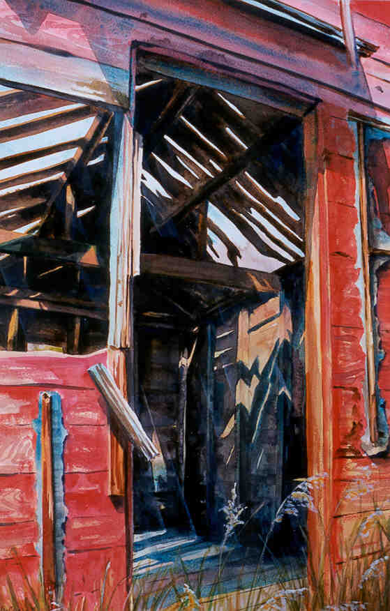
"A Door Unhinged"
Watercolour
"A Door Unhinged"
Watercolour
Another collection that caught my eye was Skyscapes. It looks like Sheldon paints the sky at different places and times. I like the variety of colours used in the collection, and how all of them set different moods. I like the picture below because it has a calming mood, and you can tell that the sun is rising.

"October Morning Mists"
Oil on Canvas
"October Morning Mists"
Oil on Canvas
Well that's it for now, I will be back soon, and make sure to look at Ian Sheldon's website!
Wednesday, April 21, 2010
"U"
Hello, hello everyone!
I just wanted to let everyone reading know that my CyberArts class went to see the Sprockets International Film Festival. Unfortunately I had to miss the first show we went to, which were many short films. On the bright side, I met up with my class and saw a wonderful French film called U.
The "U", I believe is short from unicorn, and it is the name of the main character in the film, a unicorn named U (In the picture on the left).
The film was really entertaining, and I believe it was made in France. I noticed a lot of differences from that animation compared to our typical North American animation. For one, the whole movie looked panted or drawn to me, which I thought was really interesting because I'm so used to animated movies looking like they were made to look realistic or computer generated. Another thing was the bright colours used, which I really liked.
The film is a children's film, which I found a bit weird, because some of the content in it was a bit mature. In Canada it would probably be PG-13, but the culture in France is obviously different from Canada, so it was cool to see what else is out there.

If you want to read a bit about the story line, here is a link I found to a short synopsis (scroll to the bottom of the page).
-Roshni
I just wanted to let everyone reading know that my CyberArts class went to see the Sprockets International Film Festival. Unfortunately I had to miss the first show we went to, which were many short films. On the bright side, I met up with my class and saw a wonderful French film called U.
The "U", I believe is short from unicorn, and it is the name of the main character in the film, a unicorn named U (In the picture on the left).
The film was really entertaining, and I believe it was made in France. I noticed a lot of differences from that animation compared to our typical North American animation. For one, the whole movie looked panted or drawn to me, which I thought was really interesting because I'm so used to animated movies looking like they were made to look realistic or computer generated. Another thing was the bright colours used, which I really liked.
The film is a children's film, which I found a bit weird, because some of the content in it was a bit mature. In Canada it would probably be PG-13, but the culture in France is obviously different from Canada, so it was cool to see what else is out there.
If you want to read a bit about the story line, here is a link I found to a short synopsis (scroll to the bottom of the page).
-Roshni
Saturday, April 10, 2010
Candy Cane Text
Hey guys!
I was looking through some photoshop tutorials and I found a tutorial on how to make text look like candy canes. I thought it was cool so I thought I'd check it out.

You start by making the candy cane pattern as the background. After that you type out the text you want and adjust it (adjustments are shown in the tutorial.) Then you have to select the text (ctrl+click on the text layer). The tutorial is straightforward, so it'll guide you through the rest.
I hope that was helpful! It takes a lot of steps, but the finished product (The image shown is from the website, I'm working on my own right now) looks really cool. I know the holidays have passed a long time ago, but I liked the effect.
-Roshni
I was looking through some photoshop tutorials and I found a tutorial on how to make text look like candy canes. I thought it was cool so I thought I'd check it out.
You start by making the candy cane pattern as the background. After that you type out the text you want and adjust it (adjustments are shown in the tutorial.) Then you have to select the text (ctrl+click on the text layer). The tutorial is straightforward, so it'll guide you through the rest.
I hope that was helpful! It takes a lot of steps, but the finished product (The image shown is from the website, I'm working on my own right now) looks really cool. I know the holidays have passed a long time ago, but I liked the effect.
-Roshni
Monday, March 15, 2010
Hey There Spring!
Wow So it's finally springtime and the weather is in double digits, just in time for March Break!
I can't wait to go outside; it's been incredibly gloomy before. Because it's so nice and sunny I just wanna run around and be active.
It makes me so happy when I can step outside with only a light jacket on, and not only that, but now I can stay outside longer because it won't get dark till late.
At night, it looks so good when the sun sets. I can actually go out and enjoy the weather, and it reminds me of past summers and springs and how much fun I've had, and the memories I've made. Now I can't wait to have more fun and make more memories.
I can't wait to walk home once school starts again; I just feel like being active in the sun, even though I'm incredibly uncoordinated.
That's it for this week, I'm gonna enjoy the weather!
Subscribe to:
Posts (Atom)