Showing posts with label Weekly Blog - Artistic Inpiration. Show all posts

Friday, June 3, 2011

(aq)

I posted the title as (aq) as a chemistry joke, although it's probably not funny, it means aqueous, which is the title of the series of images this blog is about : Aqueous II.

Corny jokes aside, when I saw these, I thought they had been photoshopped for sure, but they are actually pictures of paint being dropped in water.

This reminded me of a mushroom, then it reminded me of a plate; there is a very broad range of interpretations, but then I read what they actually are, and it made a lot  more sense.

There is a certain beauty to these. The artist may have had a specific meaning he was trying to communicate, but to me I see it as taking he picture for the sake of taking it. Sometimes we need that, but then we get inspired by something along the way.

These remind me of dance, which has become a big part of my life in the past few years. There's a flow to it that reminds me of ballet or lyrical (which, by the way, I am way to uncoordinated to even attempt).

The one that really reminded me of dance was this one:

There is something really dramatic about it, especially the yellow paint that is center right. The way it flows is very graceful and fluid. There's a transparency that looks like brushstrokes although it is not a painting.

I also love the colours. They are the three primary colours, but they are not meshed together to create a muddy colour; they contrast each other nicely, especially the yellow.

Eye Art

Hello!

Now, I'm not usually one for makeup, but when I saw this, my jaw dropped. This makeup artist uses eye-shadow to create famous scenes from Disney movies on eyelids. Here's the link.

What fascinated me most is the detail -- I have a hard enough time using three colours on my eyes, but to paint in a scene of a boat, or floating lamps is amazing. Here is a scene from Tangled:

What stands out to me most are the floating lamps  done as gold specks; it's really simple but effective. It's very subtle, but even the eyelashes are coloured indigo.

Another one of my favourites is the Aladdin one.


I love the blending on this; the colour choices on the right eye make it feel very warm, like a sunset, and on the left eye, the colours are cooler, making it feel like the sun has already set on that place. It creates a very broad field of view. 

When I saw these, I was very interested in them. I just wish there were images posted of what the eyes looked like when they were open; I feel like they would create an amazing effect. The amazing makeup artist is Katie Alves. Her work is amazing, and she doesn't just stop at eyes, there are paintings on lips as well.

Monday, May 23, 2011

Edward Burtynsky

Happy Victoria Day!

In tech class this past week we have started our photography unit. To commence it, we watched a documentary on the famous photographer Edward Burtynsky.

The film Manufactured Landscapes, is a documentary of how Burtynsky photographs his main subjects, which are manufactured landscapes. I found the film very interesting because it demonstrates the effort he puts in to taking these magnificent photos. It gives us a very real idea of where all of the materials we use come from, and the damage it does on not only the environment, but peoples' living conditions in other countries such as China. Although it was a bit slow at times, especially in the beginning, I can tell that it is purposeful in order to catch our attention again, and to show the scale of such industries. At the start of the film, there is a long stretch of video for several minutes of the camera travelling through a factory that makes irons. As mentioned before, it shows us how large the factory is, and how many people there are. The other thing that impacted the film hugely were the sounds in the background. They were very subtle, but they were enough to make someone feel inspired, scared, disgusted, etc. If the sounds were absent, there would be something missing from the film.

I've researched his work, and the picture on the left is the one I recognize the most. At first I thought it was just another beautiful picture. Once I read about it I was shocked; I thought that this disgustingly tainted water was from somewhere else in the world, but it is from Sudbury, Ontario in 1996.

I like how Burtynsky takes all of the environmental problems we fight so hard to push to the back of our minds and shoves them in our faces once again so we cannot help but acknowledge them.

The second picture os of the massive oil spill on the Gulf of Mexico a year ago. Looking at the images, it's easy to imagine just how huge these landscapes are. Without the pictures acting as visual guides, if we had only heard about the oil spill, the effect wouldn't be the same.

All in all, I really like Burtynsky's work and the impact it makes.

Wednesday, May 4, 2011

Leonid Afremov

There are many times that a painting will catch my eye, but only once in a while will I stop to stare at a painting just to take in the beauty of it. I was on StumbleUpon (yet again), and happened upon the artist Leonid Afremov. What I thought was especially unique was his use of the palette knife. I've always wanted to, but never had the opportunity to use oil paint as my medium, so oil paintings fascinate me.

Towards Love
The effect the palette knife makes fascinates me, because even though there are fairly large blocks of colour, when looked at from a distance, it all comes together.

With the palette knife, it's easy to create the effect of water, so many of Afremov's paintings have to do with rain or water bodies. The reflection on the ground feels real although you can tell it is a painting.

I like these pieces because they have such a gentle and serene feel to them. The vibrant colours often create the illusion of a sunset.

That's about all I have to say; after seeing these I know I want to experiment with oil paints and palette knives.

Rain of Fire
Have a nice Wednesday! And you can check out the rest of the paintings HERE.

Saturday, April 23, 2011

Art Inspired Food!

Happy Easter!

I don't really celebrate, but I am grateful for the long weekend! We were also blessed with the gorgeous day. I didn't really take advantage of it as much as I should have, as chemistry homework was calling me. I did keep the window open though.

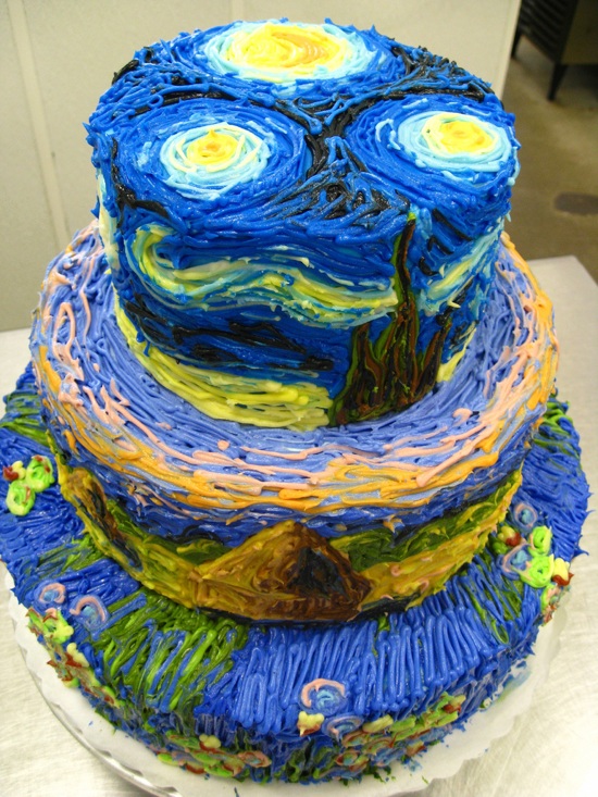
In other wordsm I found this nifty cake on the internet! (Yes I just said nifty). It's inspired by Van Gogh's Starry Night. I love how someone decided to incorporate a famous painting into a dessert. Even thought it's only icing, you can tell that the artist/cook incorporated the brushstrokes on the surface of the cake.

I like it because it is something different and three dimensional. It is not just a paining that has been remade on a flat cake, but this is all around the cake on three different levels.

And that's all for now; I made myself hungry just in time for dinner. I will try to blog again this weekend, as I'm behind on my weekly postings.

Have a lovely weekend!

Sunday, April 3, 2011

Peter Callasen

Time for my weekly blog!  I haven't written about an artist yet, and I just found one now...

Peter Callasen is an artist who focuses on using white paper in many different, interesting and creative ways. He makes miniature sculptures using just white paper and glue!

I thought I would post some of my favourite works by him. He creates powerful images using only paper, but in such a skillful way. Most of his pieces are made from only acid free paper and glue! It's unbelievable how he creates sculptures with such intricate detail using those materials.

"Looking Back"
2006


It's interesting how he uses the cut out space in his paper to enhance his work. In this it is a shadow; I see it as someone who has passed looking back at his life, perhaps regretfully. I get the feeling he did not live as much as he wanted to.


"Erected Ruin"
2007
This next piece kind of reminds me of the first. It feels like an attempt at restoring an old monument. However, the shadow shows that it is not what it once was.

Anyways, have a good week everyone.

Saturday, March 5, 2011

Silk

Happy Saturday!

I really do need to catch up on my blog posts :S

I actually found this a while ago and thought it was really cool. It's a website called silk where you click and drag your mouse in the designated area, and the "Silk" will travel with the wind to create designs.  It was created by a Computer Science and Lingusitics student.

I liked it because it was so random. (Yes I was stumbling again). You just need to make a really simple line and it will grow whichever way you want it to.

THIS is the silk I made, and THIS is the silk website.

Anyways, I find it interesting how you have little control of how the silk moves, nor do you have control of the colours it makes. You really have to experiment with the program for the best results, and some really neat ones are posted on the website, and you can watch the replays.

The one that I made that I posted is the one that I liked best out of all of the ones that I tried. I realized it was the best because it was so simple. As most things, simplicity wins.

I'm out, Enjoy your weekend:)

Saturday, June 19, 2010

Art in Food?

Hey!

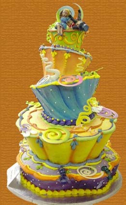
Maybe I'm just craving sweets while I'm writing this, maybe I'm just too tired, or maybe I actually believe cooking is an art. I think it's a mix of all three. I was watching the show Ace of Cakes on the Food Network and I realized that food can be really pretty. And most importantly, edible.

For example, the cake shown on the left just looks amazing! It's insane how anyone could craft such a thing out of food. I'm not so sure how it would taste though, but I wouldn't want to take the first bite and ruin it. I love the detail and the fun colours of it. You can tell that the people that made it are really creative and talented.

It's when I look at things like this that I want to learn how to cook. Ever since a kid I've wanted to, but I'm lazy (I've probably mentioned this before) and I just never got around to it. But then again, my mom said I have to learn this summer if I don't get a job or get an extra credit. So I guess when I'm forced to learn these things I'll enjoy doing it. Of course, I'm not going to learn how to bake things like cookies and cake, but I really want to know how to cook my own traditional Indian food. That's what I'm going to want to eat if I move away for University.

There's even art in Indian food, though, and that's what I love. Everything can be made to look unique and attractive.

Well that's all for now, if you don't already watch the show Ace of Cakes, check it out, but try not to get hungry:)

Change of Heart - A Novel by Jodi Picoult

Hey!

So because the movie My Sister's Keeper came out, I really wanted to read the book before seeing the movie... unfortunately due to my laziness I never got around to doing either.

But, the other day I was at the bookstore, and a book by Jodie Picoult (The author of My Sister's Keeper) was on sale. I figured "why not" to see if I would like the way she writes.

The book I read was Change of Heart, and it turns out that I love the way she writes. I was really shocked at the story line. Judging from the book title and cover, I figured it would just be another love story. I was really wrong. It has so many topics packed into one book, and somehow it all fits together.

Religion has been included in the book; peoples' beliefs have been challenged just by meeting new people.

What shocked me most was that the main topic in the book was the death penalty, and that the book took place in 2008.

In a nutshell, one of the characters in the book's husband and daughter were murdered. The murderer was sent to prison and was going to be give the death penalty in 11 years. The mother had her late husband's daughter shortly after her daughter and the guy that murdered the two people was sentenced to death. 11 years later, the daughter, Claire, needs a heart, and Shay (the murderer) wants to give his to her when he dies. All the prison guards think he's going crazy because of that and call in a Priest to be his "spiritual advisor." After some miracles Shay performed, people are starting to believe he's God. After a while even the Priest is convinced.

A lot of other things happen, but I just wanted to show you how many different topics there are in the book, and I really recommend it to anyone who is looking for something to read.

And now I have to get more of her books for summer!

Friday, April 23, 2010

Ian Sheldon

Hey guys,

I was looking for something to blog about today and stumbled on the Canadian, self taught artist Ian Sheldon.

Sheldon paints and does photography. I looked through the his collections of paintings, and I really liked the collection Rural Paintings. I love the old, broken down feel of the buildings, somewhat because I like the country and rural areas, and I want to live in the countryside at some point in my life.


"Fading Red Granary"
Watercolour

I like the colour choices Sheldon uses. In the picture shown above, the red outshines the browns and grays in the paintings, and I like that my eye goes to the red before it wanders to see inside the building. But then I saw other ones where the neutral colours are dominant, but there's an unexpected splash of colour, like the one below, with the light coming through the window.


"A Door Unhinged"
Watercolour

Another collection that caught my eye was Skyscapes. It looks like Sheldon paints the sky at different places and times. I like the variety of colours used in the collection, and how all of them set different moods. I like the picture below because it has a calming mood, and you can tell that the sun is rising.


"October Morning Mists"
Oil on Canvas

Well that's it for now, I will be back soon, and make sure to look at Ian Sheldon's website!

Saturday, February 27, 2010

Henri Silberman

Henri Silberman is a photographer, who was born in Paris but grew up in Brooklyn. He has been fascinated with photography since he bought his first camera at age 16.

I looked at some of his work and it really gets my attention. Most of his work is in black and white, with a few colour pictures. I've always been a huge fan of black and white photography, because the contrast is so much clearer, and I think you can actually what's going on in the picture better without colours.

Silberman takes his photos at such perfect timing, it feels like I could walk into them because everything would be moving perfectly. Even though the pictures are still, it still feels like they are moving.

"Spring Swan" By Henri Silberman

Spring swan (228)

I love how everything in the photos are bold, and there is high contrast. It gives me something to look at, to think about and that's why I like his work.

"Trees and Shadows" by Henri Silberman
Trees and shadows (350)
You should check out his website, the link to which I've attached in the beginning of the post! I'll blog again in a few days.