Showing posts with label Art. Show all posts

Friday, June 3, 2011

(aq)

I posted the title as (aq) as a chemistry joke, although it's probably not funny, it means aqueous, which is the title of the series of images this blog is about : Aqueous II.

Corny jokes aside, when I saw these, I thought they had been photoshopped for sure, but they are actually pictures of paint being dropped in water.

This reminded me of a mushroom, then it reminded me of a plate; there is a very broad range of interpretations, but then I read what they actually are, and it made a lot  more sense.

There is a certain beauty to these. The artist may have had a specific meaning he was trying to communicate, but to me I see it as taking he picture for the sake of taking it. Sometimes we need that, but then we get inspired by something along the way.

These remind me of dance, which has become a big part of my life in the past few years. There's a flow to it that reminds me of ballet or lyrical (which, by the way, I am way to uncoordinated to even attempt).

The one that really reminded me of dance was this one:

There is something really dramatic about it, especially the yellow paint that is center right. The way it flows is very graceful and fluid. There's a transparency that looks like brushstrokes although it is not a painting.

I also love the colours. They are the three primary colours, but they are not meshed together to create a muddy colour; they contrast each other nicely, especially the yellow.

Eye Art

Hello!

Now, I'm not usually one for makeup, but when I saw this, my jaw dropped. This makeup artist uses eye-shadow to create famous scenes from Disney movies on eyelids. Here's the link.

What fascinated me most is the detail -- I have a hard enough time using three colours on my eyes, but to paint in a scene of a boat, or floating lamps is amazing. Here is a scene from Tangled:

What stands out to me most are the floating lamps  done as gold specks; it's really simple but effective. It's very subtle, but even the eyelashes are coloured indigo.

Another one of my favourites is the Aladdin one.


I love the blending on this; the colour choices on the right eye make it feel very warm, like a sunset, and on the left eye, the colours are cooler, making it feel like the sun has already set on that place. It creates a very broad field of view. 

When I saw these, I was very interested in them. I just wish there were images posted of what the eyes looked like when they were open; I feel like they would create an amazing effect. The amazing makeup artist is Katie Alves. Her work is amazing, and she doesn't just stop at eyes, there are paintings on lips as well.

Saturday, April 23, 2011

Art Inspired Food!

Happy Easter!

I don't really celebrate, but I am grateful for the long weekend! We were also blessed with the gorgeous day. I didn't really take advantage of it as much as I should have, as chemistry homework was calling me. I did keep the window open though.

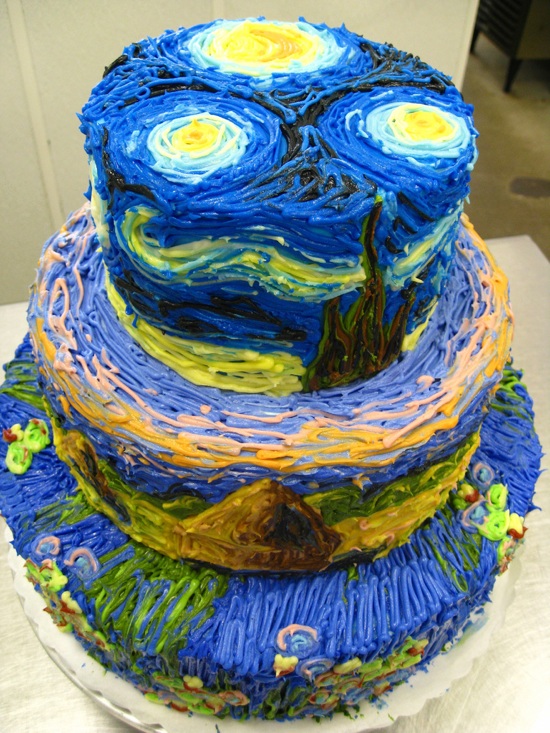
In other wordsm I found this nifty cake on the internet! (Yes I just said nifty). It's inspired by Van Gogh's Starry Night. I love how someone decided to incorporate a famous painting into a dessert. Even thought it's only icing, you can tell that the artist/cook incorporated the brushstrokes on the surface of the cake.

I like it because it is something different and three dimensional. It is not just a paining that has been remade on a flat cake, but this is all around the cake on three different levels.

And that's all for now; I made myself hungry just in time for dinner. I will try to blog again this weekend, as I'm behind on my weekly postings.

Have a lovely weekend!

Wednesday, April 20, 2011

Chair Design - Book Chair

For our most recent art assignment, we were asked to design chairs that exuded our personality. For myself, whenever I sit down I want something comfortable that I could curl up in to read a book or watch t.v.... or just sleep.
Model
I designed my chair to resemble a book. Of course, this is only the model and not the actual chair. We used foam core to make the chairs, and I used paper as well as the upholstery.

I feel like this exudes my personality because it is a book. The word hold many meanings to me, not just that it means reading. I feel like books symbolize knowledge, wisdom, understanding, creativity and free thought. I hope to have at least some of these qualities.

I want it to be very comfortable, because I like comfort and simplicity. I was also debating to have to surface have words on it, but I thought against it because this way it felt like blank pages of a journal. I was surprised at myself for not having done something more technical or geometrical, but I am happier with this than I would have been with a scientific chair.

Orthographic Drawing
The chairs are supposed to be works of art. I feel like my chair is a piece of art. The difference between the curvy and straight lines create contrast. The varied levels of my chair make light and shadow. I feel like the texture on the chair is visible by the paper acting as what I want to be the microfiber. The colours I would want for the chair are just plain white for the seating part, and a customizable solid colour for the back. The colours would be bright or black to create contrast with the white.

Isometric Drawing
I would also add lines on the side of the chair to add the impression of pages in a book. This would make more organic lines to contrast with the straight ones.

My chair is just over a quarter of a meter high off the ground. If I were to sit on it, by feet would just dangle off of the ground. There is a storage area dedicated to books, but I suppose other items would fit as well. The seating area is very soft and comfortable; you would sink in if you were to sit in it.


Wednesday, March 30, 2011

SketchUp!

Hey! So we have begun our furniture design unit in art. We are designing chairs that exude our personalities (mine is a book!) and today we tried to made 3D models in a program called SketchUp. Just so you know, we had about a half hour to do this, so it's pretty decent in my opinion! There are two chairs:

My Chair in SketchUp
The model on the right resembles my design more than the other one. I also tried to keep the scale the same as my design.

Thursday, March 24, 2011

Romanticism Collage - Artist Statement

Happy Thursday!

Recently we just finished our Romanticism unit, so I'm posting the collage set that I made for it. My concept was on horrors of war; I focused on the political situation in North African and Middle Eastern countries, but mainly on Libya and Egypt. My thoughts were that as Egypt finally drove their dictator out, Libyans were starting to protest; the little peace that was left in Libya is leaving and there is peace at last in Egypt. The situation in Libya seems to be getting worse with each passing day, and I know foreign countries are trying to assist the country, but civilians are getting hurt and killed when it is probably avoidable.

Collage Representing Egypt
The first image is to represent Egypt; I mentioned before that just as peace was entering Egypt, it was leaving Libya. In here I show the ominous red sunset in Cairo being broken along with Mubarak's image. I incorporated the Twitter and Facebook icons because those social networking sites are one of the reasons the world got to know about the protests so suddenly. I found out almost immediately through Twitter.

The composition in this is diagonal; it could have been something else had the dove been elsewhere, but I placed it so the piece would have a diagonal composition. I also wanted the composition on the Libya collage to match the Egypt collage.

I really want the eye to go towards the dove, as it unifies the two pieces together as a set, and I believe it is the focal point of the piece. I was debating between the gold gift-wrap I happened upon in a magazine or just white paper; I'm very happy I went with the gold paper as it shimmers, and eyes will drift toward it automatically.


Collage Representing Libya
The second image is of the Libya collage; in this image the dove is shown leaving; when I began the project the crisis was just beginning. If I were to start it now I would keep the dove smaller and show very little of it leaving, as the condition of the country now is very tense.

It was in this image where I wanted to illustrate the horrors of war. I didn't want to show people getting hurt, because I feel like that may be the obvious thing to do. Instead I show a calm Libyan night breaking down, along with the map of Libya beginning to break with the peaceful night. The only images that are not dissolving are of Gadaffi's and his female soldiers. One thing I really wanted to incorporate wasbhis female bodyguards. Even in today's modern state of mind I found that surprising, but very interesting.

I did not want to show the dove breaking with the night and the map because first of all, it unifies my piece. Secondly, no matter what others believe I think there is still peace in many parts of the world, and the dove represents all places.

I mentioned before that this piece has a diagonal composition; in this one as well if the dove was placed differently there would be a completely different composition. This one is different than the first because there is a lot more negative space in it, showing how blackness is taking over.

The last thing to mention is my colour choice. I chose black for the Libyan collage and white for the Egyptian collage. I was really debating the black and white choice, because in my culture and religion, white is a mourning colour, while black is considered ominous. I still went with white for the Egypt collage because it is still bright, and brings contrast and light into the piece. Another reason is that they were and probably are still mourning for those killed and injured during riots and protests.

I was very unsure of this project when we began it, but I really started to appreciate how professional and artistic collages can be near the end.

Saturday, March 5, 2011

Croppings - First Art Assignment

Original Cropping
This is the original cropping that I cut out. We all cropped these from giant group pictures everyone contributed to.

I know they weren't supposed to be a set shape, but I chose mine because it looked like a sun, but then when I cropped it, it actually looked more like a flower. I chose it because I liked the L - Shape composition in it.


Large Painting
As much as I desperately long for precision and control, I thoroghly enjoyed the big painting. It forced me to be quick and not worry about the small details. I really like the thick brush strokes in this, especially the green line. At first it was really thin, as I didn't want it too thick, but I really think it works, as the yellow, orange and red also have thick lines, but still thicker than green so they're different. I also like how in some places you can see the thick texture of the paint, although it doesn't show as well on the picture.


Small Painting

I'm really proud of how I did the brush strokes in this, especially in the yellow. Although there was less value I the yellow, when the painting is viewed in person and up close, I think the brush strokes make up for it. I had a similar problem with the green line on the smaller painting as I did with the big painting. I did the same thing and made the line bigger. The main issue was that my thin brush just wouldn't hold enough paint to drag it down the canvas all the way, as it wouldn't hold enough paint.

In some ways I liked the big painting better, but in some ways I liked the small more. I liked the small one because I had more control, but in the big one I also liked that I had to really make my brushstrokes purposeful and quick. It's hard to choose a favourite, but I do know I like the paintings better than the pastel, which is not posted on the blog.

This assignment was a great way to start off the new semester, and I really enjoyed it, especially the painting.

Friday, April 23, 2010

Ian Sheldon

Hey guys,

I was looking for something to blog about today and stumbled on the Canadian, self taught artist Ian Sheldon.

Sheldon paints and does photography. I looked through the his collections of paintings, and I really liked the collection Rural Paintings. I love the old, broken down feel of the buildings, somewhat because I like the country and rural areas, and I want to live in the countryside at some point in my life.


"Fading Red Granary"
Watercolour

I like the colour choices Sheldon uses. In the picture shown above, the red outshines the browns and grays in the paintings, and I like that my eye goes to the red before it wanders to see inside the building. But then I saw other ones where the neutral colours are dominant, but there's an unexpected splash of colour, like the one below, with the light coming through the window.


"A Door Unhinged"
Watercolour

Another collection that caught my eye was Skyscapes. It looks like Sheldon paints the sky at different places and times. I like the variety of colours used in the collection, and how all of them set different moods. I like the picture below because it has a calming mood, and you can tell that the sun is rising.


"October Morning Mists"
Oil on Canvas

Well that's it for now, I will be back soon, and make sure to look at Ian Sheldon's website!

Monday, February 15, 2010

El Anatsui


I found out recently that I am a very privileged student, because I get my artwork displayed at the ROM, along with the world renowned artist El Anatsui. And because of that I'm going to share some information about him.

Anatsui is a sculpter, born in 1944 in Anyako, Ghana, and was taught at the College of Art, University of Science. He has been working as a professor at a Nigerian University for about thirty years.

Much of Anatsui's work is based on traditional Ghanaian beliefs. The mediums he uses change a lot; once it was clay, mixed normally with manganese. After, he made wall panels with wood strips placed next to each other; he cut and burned designs into them.

Some of the themes of his work are destruction and reconstitution, as mentioned before, he likes to base things off traditional Ghanaian and African beliefs and cultures.

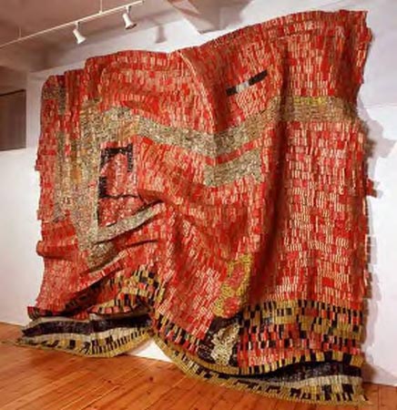
Most recently, he has taken hard, ugly metal liquor bottle caps taken from garbage and turned them into something beautiful and flowing. He wants to get rid of metal's usual stereotype of hard, rigid, stiff, rusty material, and let people see that it can be soft, and it can be beautiful. Some also resemble African cloths.


His artwork has focused on a wide range of social, historical and political issues. The art can have many meanings. A historical example is that European traders used liquor bottles as currency when they wanted slaves, and the liquor was usually a product of slave labour. Anatsui's artwork reminds people of this.

Anatsui's work is extraordinary to me, especially his metal cloths. They jump out at me and they look so delicate and soft to touch. He makes me think that metal doesn't always have to be a hard, heavy, ugly brick. It looks almost delicate, like it would tear if anyone were to touch it, and I never would have thought of metal in that way before I saw his work.

I am ecstatic that I am going to be working with such a talented artist at the ROM, and I know it's going to be an experience I'll never forget.


Works Cited:

"Brahim El Anatsui." African Success. 14 Jul 2007. African Success, Web. 15 Feb 2010


Worth, Alexi. "A Thousand Bottles." The New York Times. 02 Feb 2009. The New York Times, Web. 15 Feb 2010.

Krut, David. "El Anatsui New York." October Gallery. October Gallery, Web. 15 Feb 2010. .