Yes, this is late, but better late than never?
A few weeks ago, guest artists came to class to help us with our Shazaam projects. The idea was to take pictures of our school, and bring the positive aspects of our school to the outside. By outside, I mean our pieces have been published to a local newspaper.
For mine, I really wanted to bring out all of the creativity of our school so that other people could see what a positive impact it has made on us.
Much of my design are just mistakes that I liked. That's my favourite part of the design process: when I have an original idea that I am satisfied with, but I make a random error and I fall in love with it. For me it was the paint splatters.
I was playing around in illustrator and mistakenly copied and pasted it into Photoshop on the back wall; it looked almost as if paint was splattered on the wall. I liked that idea because it gives he idea that with art at my school, we are limitless. Much of the time we are allowed to do almost whatever we want and we are given freedom to communicate our ideas through design.
I wanted to show that by having "knowledge and creativity" crawling through the halls. I did this with the paint splatters and colourful lines; I also represented the different kinds of art and resources we have with pictures of them or symbolizing them.
One thing I would change would be the fonts; it was a very last minute idea, and I feel like they do not match with my design.
Showing posts with label Weekly Blog. Show all posts
Wednesday, June 8, 2011
Monday, June 6, 2011
Crystal River
I saw the most amazing thing the other day, it's called the Crystal River. The colours are the result of algae waste, and it creates these beautiful colours naturally.
It's so wonderful how something like this could just happen, without the influence of humans. I love how vibrant the colours are, and it is impossible to not notice them.
At first I thought this was photoshopped, but it's real. The colours work together so well, especially the reds and blues. It almost looks natural, like it is normal.
![]() |
| The Crystal River |
At first I thought this was photoshopped, but it's real. The colours work together so well, especially the reds and blues. It almost looks natural, like it is normal.
Friday, June 3, 2011
(aq)
I posted the title as (aq) as a chemistry joke, although it's probably not funny, it means aqueous, which is the title of the series of images this blog is about : Aqueous II.
Corny jokes aside, when I saw these, I thought they had been photoshopped for sure, but they are actually pictures of paint being dropped in water.
This reminded me of a mushroom, then it reminded me of a plate; there is a very broad range of interpretations, but then I read what they actually are, and it made a lot more sense.
There is a certain beauty to these. The artist may have had a specific meaning he was trying to communicate, but to me I see it as taking he picture for the sake of taking it. Sometimes we need that, but then we get inspired by something along the way.
These remind me of dance, which has become a big part of my life in the past few years. There's a flow to it that reminds me of ballet or lyrical (which, by the way, I am way to uncoordinated to even attempt).
The one that really reminded me of dance was this one:
There is something really dramatic about it, especially the yellow paint that is center right. The way it flows is very graceful and fluid. There's a transparency that looks like brushstrokes although it is not a painting.
I also love the colours. They are the three primary colours, but they are not meshed together to create a muddy colour; they contrast each other nicely, especially the yellow.
Corny jokes aside, when I saw these, I thought they had been photoshopped for sure, but they are actually pictures of paint being dropped in water.
This reminded me of a mushroom, then it reminded me of a plate; there is a very broad range of interpretations, but then I read what they actually are, and it made a lot more sense.
There is a certain beauty to these. The artist may have had a specific meaning he was trying to communicate, but to me I see it as taking he picture for the sake of taking it. Sometimes we need that, but then we get inspired by something along the way.
These remind me of dance, which has become a big part of my life in the past few years. There's a flow to it that reminds me of ballet or lyrical (which, by the way, I am way to uncoordinated to even attempt).
The one that really reminded me of dance was this one:
I also love the colours. They are the three primary colours, but they are not meshed together to create a muddy colour; they contrast each other nicely, especially the yellow.
Eye Art
Hello!
Now, I'm not usually one for makeup, but when I saw this, my jaw dropped. This makeup artist uses eye-shadow to create famous scenes from Disney movies on eyelids. Here's the link.
What fascinated me most is the detail -- I have a hard enough time using three colours on my eyes, but to paint in a scene of a boat, or floating lamps is amazing. Here is a scene from Tangled:
What stands out to me most are the floating lamps done as gold specks; it's really simple but effective. It's very subtle, but even the eyelashes are coloured indigo.
Another one of my favourites is the Aladdin one.

Now, I'm not usually one for makeup, but when I saw this, my jaw dropped. This makeup artist uses eye-shadow to create famous scenes from Disney movies on eyelids. Here's the link.
What fascinated me most is the detail -- I have a hard enough time using three colours on my eyes, but to paint in a scene of a boat, or floating lamps is amazing. Here is a scene from Tangled:
Another one of my favourites is the Aladdin one.
I love the blending on this; the colour choices on the right eye make it feel very warm, like a sunset, and on the left eye, the colours are cooler, making it feel like the sun has already set on that place. It creates a very broad field of view.
When I saw these, I was very interested in them. I just wish there were images posted of what the eyes looked like when they were open; I feel like they would create an amazing effect. The amazing makeup artist is Katie Alves. Her work is amazing, and she doesn't just stop at eyes, there are paintings on lips as well.
Thursday, June 2, 2011
Photography!
Hey! So the other day, I went out with a group of other students to try out the cameras to begin our photography unit. We posted the pictures on Payal's Blog, so just head over there to check out the pictures!
Monday, May 23, 2011
Edward Burtynsky
Happy Victoria Day!
In tech class this past week we have started our photography unit. To commence it, we watched a documentary on the famous photographer Edward Burtynsky.
The film Manufactured Landscapes, is a documentary of how Burtynsky photographs his main subjects, which are manufactured landscapes. I found the film very interesting because it demonstrates the effort he puts in to taking these magnificent photos. It gives us a very real idea of where all of the materials we use come from, and the damage it does on not only the environment, but peoples' living conditions in other countries such as China. Although it was a bit slow at times, especially in the beginning, I can tell that it is purposeful in order to catch our attention again, and to show the scale of such industries. At the start of the film, there is a long stretch of video for several minutes of the camera travelling through a factory that makes irons. As mentioned before, it shows us how large the factory is, and how many people there are. The other thing that impacted the film hugely were the sounds in the background. They were very subtle, but they were enough to make someone feel inspired, scared, disgusted, etc. If the sounds were absent, there would be something missing from the film.
I've researched his work, and the picture on the left is the one I recognize the most. At first I thought it was just another beautiful picture. Once I read about it I was shocked; I thought that this disgustingly tainted water was from somewhere else in the world, but it is from Sudbury, Ontario in 1996.
I like how Burtynsky takes all of the environmental problems we fight so hard to push to the back of our minds and shoves them in our faces once again so we cannot help but acknowledge them.
The second picture os of the massive oil spill on the Gulf of Mexico a year ago. Looking at the images, it's easy to imagine just how huge these landscapes are. Without the pictures acting as visual guides, if we had only heard about the oil spill, the effect wouldn't be the same.
All in all, I really like Burtynsky's work and the impact it makes.
In tech class this past week we have started our photography unit. To commence it, we watched a documentary on the famous photographer Edward Burtynsky.
The film Manufactured Landscapes, is a documentary of how Burtynsky photographs his main subjects, which are manufactured landscapes. I found the film very interesting because it demonstrates the effort he puts in to taking these magnificent photos. It gives us a very real idea of where all of the materials we use come from, and the damage it does on not only the environment, but peoples' living conditions in other countries such as China. Although it was a bit slow at times, especially in the beginning, I can tell that it is purposeful in order to catch our attention again, and to show the scale of such industries. At the start of the film, there is a long stretch of video for several minutes of the camera travelling through a factory that makes irons. As mentioned before, it shows us how large the factory is, and how many people there are. The other thing that impacted the film hugely were the sounds in the background. They were very subtle, but they were enough to make someone feel inspired, scared, disgusted, etc. If the sounds were absent, there would be something missing from the film.
I've researched his work, and the picture on the left is the one I recognize the most. At first I thought it was just another beautiful picture. Once I read about it I was shocked; I thought that this disgustingly tainted water was from somewhere else in the world, but it is from Sudbury, Ontario in 1996.
I like how Burtynsky takes all of the environmental problems we fight so hard to push to the back of our minds and shoves them in our faces once again so we cannot help but acknowledge them.
The second picture os of the massive oil spill on the Gulf of Mexico a year ago. Looking at the images, it's easy to imagine just how huge these landscapes are. Without the pictures acting as visual guides, if we had only heard about the oil spill, the effect wouldn't be the same.
All in all, I really like Burtynsky's work and the impact it makes.
Saturday, April 23, 2011
Art Inspired Food!
Happy Easter!
I don't really celebrate, but I am grateful for the long weekend! We were also blessed with the gorgeous day. I didn't really take advantage of it as much as I should have, as chemistry homework was calling me. I did keep the window open though.
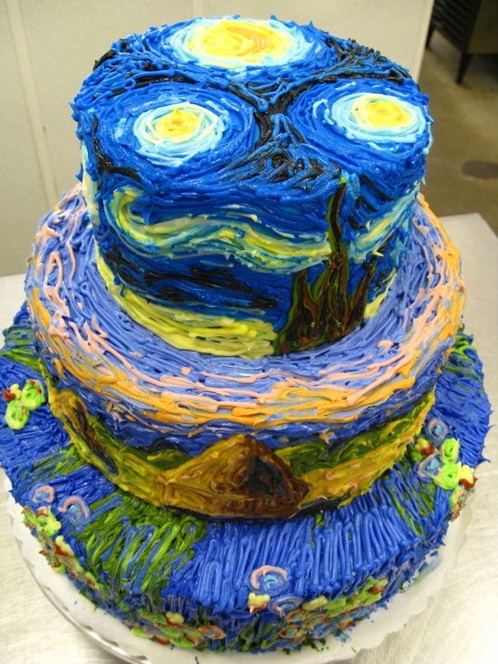
In other wordsm I found this nifty cake on the internet! (Yes I just said nifty). It's inspired by Van Gogh's Starry Night. I love how someone decided to incorporate a famous painting into a dessert. Even thought it's only icing, you can tell that the artist/cook incorporated the brushstrokes on the surface of the cake.
I like it because it is something different and three dimensional. It is not just a paining that has been remade on a flat cake, but this is all around the cake on three different levels.
And that's all for now; I made myself hungry just in time for dinner. I will try to blog again this weekend, as I'm behind on my weekly postings.
Have a lovely weekend!
I don't really celebrate, but I am grateful for the long weekend! We were also blessed with the gorgeous day. I didn't really take advantage of it as much as I should have, as chemistry homework was calling me. I did keep the window open though.
I like it because it is something different and three dimensional. It is not just a paining that has been remade on a flat cake, but this is all around the cake on three different levels.
And that's all for now; I made myself hungry just in time for dinner. I will try to blog again this weekend, as I'm behind on my weekly postings.
Have a lovely weekend!
Sunday, April 3, 2011
Peter Callasen
Time for my weekly blog! I haven't written about an artist yet, and I just found one now...
Peter Callasen is an artist who focuses on using white paper in many different, interesting and creative ways. He makes miniature sculptures using just white paper and glue!
I thought I would post some of my favourite works by him. He creates powerful images using only paper, but in such a skillful way. Most of his pieces are made from only acid free paper and glue! It's unbelievable how he creates sculptures with such intricate detail using those materials.
It's interesting how he uses the cut out space in his paper to enhance his work. In this it is a shadow; I see it as someone who has passed looking back at his life, perhaps regretfully. I get the feeling he did not live as much as he wanted to.
This next piece kind of reminds me of the first. It feels like an attempt at restoring an old monument. However, the shadow shows that it is not what it once was.
Anyways, have a good week everyone.
Peter Callasen is an artist who focuses on using white paper in many different, interesting and creative ways. He makes miniature sculptures using just white paper and glue!
I thought I would post some of my favourite works by him. He creates powerful images using only paper, but in such a skillful way. Most of his pieces are made from only acid free paper and glue! It's unbelievable how he creates sculptures with such intricate detail using those materials.
| "Looking Back" 2006 |
| "Erected Ruin" 2007 |
Anyways, have a good week everyone.
Wednesday, March 16, 2011
Peacock Feathers
A friend of mine gifted me with a few peacock feathers recently; I've always liked these feathers, but haven't physically seen them for years. Pictures are fun to look at, but it's only in person when you can appreciate their true beauty.
The colours are so vibrant; it's hard to beilieve that the metallic lines are just a genetic trait. It's amazing how something that stunning was created.
I love how the colours work so well together; looking at my feathers I know I want to do a peice with that colour scheme. They really make any dull colour look beautiful, for example my living room colour is beige, but the feathers give it a nice pickup and it directs attention towards them.
Anyways, I thought I would do a quick post on this, so it wouldn't drift from my mind.
Have a good St. Patrick's Day tomorrow!
The colours are so vibrant; it's hard to beilieve that the metallic lines are just a genetic trait. It's amazing how something that stunning was created.
I love how the colours work so well together; looking at my feathers I know I want to do a peice with that colour scheme. They really make any dull colour look beautiful, for example my living room colour is beige, but the feathers give it a nice pickup and it directs attention towards them.
Anyways, I thought I would do a quick post on this, so it wouldn't drift from my mind.
Have a good St. Patrick's Day tomorrow!
Friday, March 11, 2011
Cool Website, March Break and Other Happenings
When I say Happy Friday today, I actually mean it... It's the beginning of March Break finally! (Well it'll probably be Happy Saturday by the time I post this.)
So I thought this was a really fun website. All you basically do is draw, but there is something there that kind of webs the lines in a way to create value in a graphical drawing. I found it really interesting because it's a great way to think of creative drawings and projects; just by scribbling you can begin to imagine shapes forming in the doodles if you keep shading and going over lines.
It's also nice to just draw whatever you feel like. I'm staring to look for a lot more websites like this and silk (previous post), where you can create your own work in a new way and get inspiration from it.
On another note, I have a week off of school! Not to make it sound bad, but all of the assignments I have are CyberArts related; no English or Chem. Then again they are interesting assignments that I will probably enjoy:)
I'll probably try to post every other day on here to catch up to my missing blog posts, because as I've probably mentioned already, old habbits die hard and I'm terrible at blogging:S
Ha! There's still two minutes still Saturday!
Have a good weekend/break everyone!
So I thought this was a really fun website. All you basically do is draw, but there is something there that kind of webs the lines in a way to create value in a graphical drawing. I found it really interesting because it's a great way to think of creative drawings and projects; just by scribbling you can begin to imagine shapes forming in the doodles if you keep shading and going over lines.
It's also nice to just draw whatever you feel like. I'm staring to look for a lot more websites like this and silk (previous post), where you can create your own work in a new way and get inspiration from it.
On another note, I have a week off of school! Not to make it sound bad, but all of the assignments I have are CyberArts related; no English or Chem. Then again they are interesting assignments that I will probably enjoy:)
I'll probably try to post every other day on here to catch up to my missing blog posts, because as I've probably mentioned already, old habbits die hard and I'm terrible at blogging:S
Ha! There's still two minutes still Saturday!
Have a good weekend/break everyone!
Saturday, March 5, 2011
Silk
Happy Saturday!
I really do need to catch up on my blog posts :S
I actually found this a while ago and thought it was really cool. It's a website called silk where you click and drag your mouse in the designated area, and the "Silk" will travel with the wind to create designs. It was created by a Computer Science and Lingusitics student.
I liked it because it was so random. (Yes I was stumbling again). You just need to make a really simple line and it will grow whichever way you want it to.
THIS is the silk I made, and THIS is the silk website.
Anyways, I find it interesting how you have little control of how the silk moves, nor do you have control of the colours it makes. You really have to experiment with the program for the best results, and some really neat ones are posted on the website, and you can watch the replays.
The one that I made that I posted is the one that I liked best out of all of the ones that I tried. I realized it was the best because it was so simple. As most things, simplicity wins.
I'm out, Enjoy your weekend:)
I really do need to catch up on my blog posts :S
I actually found this a while ago and thought it was really cool. It's a website called silk where you click and drag your mouse in the designated area, and the "Silk" will travel with the wind to create designs. It was created by a Computer Science and Lingusitics student.
I liked it because it was so random. (Yes I was stumbling again). You just need to make a really simple line and it will grow whichever way you want it to.
THIS is the silk I made, and THIS is the silk website.
Anyways, I find it interesting how you have little control of how the silk moves, nor do you have control of the colours it makes. You really have to experiment with the program for the best results, and some really neat ones are posted on the website, and you can watch the replays.
The one that I made that I posted is the one that I liked best out of all of the ones that I tried. I realized it was the best because it was so simple. As most things, simplicity wins.
I'm out, Enjoy your weekend:)
Thursday, March 3, 2011
Video on Trial
Happy Thursday!
Our next tech project is to make a music video, so I'm gonna do a quick post about good and bad music videos.
The first video is what I consider a good music video. It's actually made my a YouTube star, and it's one of his first music videos. I really liked it because it was funny and had an interesting story line.
Dave Days - What Does it Take
My favourite part is when the boyfriend's friends jump on the stage but the cast mates begin fighting them with fake swords.
Something I would consider a bad music video are Taylor Swift Music videos. I like some of her songs, but honestly, who wants to watch her lying on her bed singing like her life ended for three minutes? Heres an example:
Our next tech project is to make a music video, so I'm gonna do a quick post about good and bad music videos.
The first video is what I consider a good music video. It's actually made my a YouTube star, and it's one of his first music videos. I really liked it because it was funny and had an interesting story line.
Dave Days - What Does it Take
My favourite part is when the boyfriend's friends jump on the stage but the cast mates begin fighting them with fake swords.
Something I would consider a bad music video are Taylor Swift Music videos. I like some of her songs, but honestly, who wants to watch her lying on her bed singing like her life ended for three minutes? Heres an example:
Thursday, February 24, 2011
Movie Trailer Project - I am Number Four
Happy Thursday!
This is my first year three project for tech. We had to change the mood of a movie trailer by adding music, soundeffects and voiceovers.
I worked on the movie trailer for I am Number Four. It's about an alien who has been sent to earth with eight others to help restore the planet. The first three have been destroyed, and John is Number Four; they can only be killed in sequence, so he is next. It's an action movie, with a little bit of romance. I decided to play up the romance a bit, but made it into a tragedy.
These are the three trailers/ interviews I used for footage:
Here's my version/remake on the trailer:
In my version, it appears as though the female lead, Sarah, does not trust him. Slowly they begin to like each other more but she is still cautious. Close to the climax John says, "You aren't safe here." He's brought danger to her and they need to be careful. The last few clips of the trailer show them running and Sarah is taken away. She falls off a cliff. John is then devastated he could not do anything and jumps. As the veiwer, you aren't sure if they actually die... so watch the movie to find out:). But it actually doesn't exist. So watch the actual I am Number Four.
In the words of Tigger, TTFN!
This is my first year three project for tech. We had to change the mood of a movie trailer by adding music, soundeffects and voiceovers.
I worked on the movie trailer for I am Number Four. It's about an alien who has been sent to earth with eight others to help restore the planet. The first three have been destroyed, and John is Number Four; they can only be killed in sequence, so he is next. It's an action movie, with a little bit of romance. I decided to play up the romance a bit, but made it into a tragedy.
These are the three trailers/ interviews I used for footage:
Here's my version/remake on the trailer:
In my version, it appears as though the female lead, Sarah, does not trust him. Slowly they begin to like each other more but she is still cautious. Close to the climax John says, "You aren't safe here." He's brought danger to her and they need to be careful. The last few clips of the trailer show them running and Sarah is taken away. She falls off a cliff. John is then devastated he could not do anything and jumps. As the veiwer, you aren't sure if they actually die... so watch the movie to find out:). But it actually doesn't exist. So watch the actual I am Number Four.
In the words of Tigger, TTFN!
Friday, February 18, 2011
Paint Sound Sculptures
| Paint sound sculpture, click for more |
Now reading: The Red Pyramid - Rick Riordan
I thought that might be a good way to start off my blog posts. I saw this and thought it was really interesting. For a printer advertisement, Canon used these paint sound sculptures in their commercial.
I actually stumbled upon this (using stumbleupon) and it caught my attention immediately.
The way this was done was by wrapping a membrane around a speaker, and dropping a few paint drops on the membrane. When the speaker was turned on the paint would bounce up and down.
My mind was blown when I read this. It's such a cool and creative piece, and a great idea for a commercial. If you want to see how it was done, here's the video:
Canon Pixma: Bringing colour to life from Dentsu London on Vimeo.
I really love the colours. They're so vibrant and dramatic. I imagine it would have been difficult and fun to do at the same time, as they needed to take the picture at exactly the right moment.
That's all for this week. Have a good long weekend:)
Garageband Tutorial and Other Happenings
Hello hello,
Happy Friday! Well kind of happy, it's been a long week, especially the past two days. I was also supposed to do this tutorial about a week ago, but me being me I procrastinated, so I'll be doing two posts today. Sound fun? Kay good:)
So this is the tutorial I found, for iMovie. In class we're currently working on a movie trailer project. We have to edit a movie trailer in a way that the mood of the trailer is changed. For example editing a romance so it is perceived as a horror film. I'll write more about it when I post my finished project up.
For now I thought I'd share this tutorial on iMovie that I found. It was actually my first time using iMovie, and thinking back I should have watched a tutorial before starting, as it would have made this project easier. I managed though and now I know the progam quite well.
This is a good video that shows beginners where everything is and the basic ins and outs. I'd reccomend it to anyone who is new to the program and woud like to try it out.
Happy Friday! Well kind of happy, it's been a long week, especially the past two days. I was also supposed to do this tutorial about a week ago, but me being me I procrastinated, so I'll be doing two posts today. Sound fun? Kay good:)
So this is the tutorial I found, for iMovie. In class we're currently working on a movie trailer project. We have to edit a movie trailer in a way that the mood of the trailer is changed. For example editing a romance so it is perceived as a horror film. I'll write more about it when I post my finished project up.
For now I thought I'd share this tutorial on iMovie that I found. It was actually my first time using iMovie, and thinking back I should have watched a tutorial before starting, as it would have made this project easier. I managed though and now I know the progam quite well.
This is a good video that shows beginners where everything is and the basic ins and outs. I'd reccomend it to anyone who is new to the program and woud like to try it out.
Friday, February 4, 2011
Me!
Hello!
This is my first post in the new semester, and I'll be writing about myself, starting with how I joined CyberArts.
When I was in grade eight and applying for high school, I wasn't sure that I would make it into the program, and I didn't audition. When I was in grade nine, I heard about the opportunity to join the program for year two. I auditioned and I fortunately was accepted into the program without taking the first year of CyberArts.
I really enjoy the program and I'm excited about the new semester for year three. Last year in tech I really enjoyed the typography and the self portrait, although the portrait took much longer than it should have to finish. I liked the HTML portion, and we made a website to show our portfolios.
I feel I'm open to many styles of art. Some days I really like bright and fun pieces, but sometimes I lean towards darker styles. I think it really depends on my mood.
Programs I'm familiar with are Adobe Illustrator and Photoshop; I've worked with things like Flash and Dreamweaver before, but only a few times.
Things I like doing outside of school are acting (although recently I haven't auditioned for anything because school has been so demanding), dancing, reading and drawing. My favourite subjects at school are biology, chemistry (I think, I have it this semester, so I'll see if I really like it), physics and CyberArts. I usually like school but it can be overwhelming at times. Another thing I really love is food.
There is so much variety of food that it's hard to list. I like almost anything my mom or grandma makes, so I love Indian food. It's very flavourful and different. I could eat pasta every day if I had to, especially with lots of vegetables and spicy sauce. I like pizza, especially my mom's, and like the pasta, with many vegetables in it.
I really enjoy shopping. I don't usually buy things, but I love window shopping. If I could, I would buy five pairs of shoes everyday. I would probably have a pair of shows for every outfit I own. The only downside is that I'm extremely clumsy and I can't walk in very high heels. One of the reasons I like winter is because the styles of clothing are just so much better. I love layering clothes with scarves and sweaters. Although I love clothes, I always prefer sweatpants of PJs. We were off for about a week between the end of exams and the start of semester two, and I wore jeans only once.
I think I wrote quite a bit; I hope you now know a bit about myself!
I feel I'm open to many styles of art. Some days I really like bright and fun pieces, but sometimes I lean towards darker styles. I think it really depends on my mood.
Programs I'm familiar with are Adobe Illustrator and Photoshop; I've worked with things like Flash and Dreamweaver before, but only a few times.
Things I like doing outside of school are acting (although recently I haven't auditioned for anything because school has been so demanding), dancing, reading and drawing. My favourite subjects at school are biology, chemistry (I think, I have it this semester, so I'll see if I really like it), physics and CyberArts. I usually like school but it can be overwhelming at times. Another thing I really love is food.
There is so much variety of food that it's hard to list. I like almost anything my mom or grandma makes, so I love Indian food. It's very flavourful and different. I could eat pasta every day if I had to, especially with lots of vegetables and spicy sauce. I like pizza, especially my mom's, and like the pasta, with many vegetables in it.
I really enjoy shopping. I don't usually buy things, but I love window shopping. If I could, I would buy five pairs of shoes everyday. I would probably have a pair of shows for every outfit I own. The only downside is that I'm extremely clumsy and I can't walk in very high heels. One of the reasons I like winter is because the styles of clothing are just so much better. I love layering clothes with scarves and sweaters. Although I love clothes, I always prefer sweatpants of PJs. We were off for about a week between the end of exams and the start of semester two, and I wore jeans only once.
I think I wrote quite a bit; I hope you now know a bit about myself!
Saturday, June 19, 2010
A Picture with a Story:)
I was just looking through some of my pictures and stumbled upon this one!
I thought it was really cool; I actually remember taking it, about a year ago.
I like how it's black and white. I'm not really sure what the picture is of; I kind of just randomly took a picture of a flower type object.
I was up at my friend's house that week (it's a farm.) The weather was really cool; it was the time where it was changing from winter to spring, so it was warm enough to go outside without a jacket, but there was still ice outside where the small ponds were. So naturally we tried stepping on the ice (carefully, of course.)
I just think it's a cool feeling to be able to only wear a sweater, but to have it still look like winter. Even if there is slush everywhere, I really like the feeling of it.
Anyways, I'll be back later:)
Subscribe to:
Posts (Atom)